BCF Live UX feedback
-
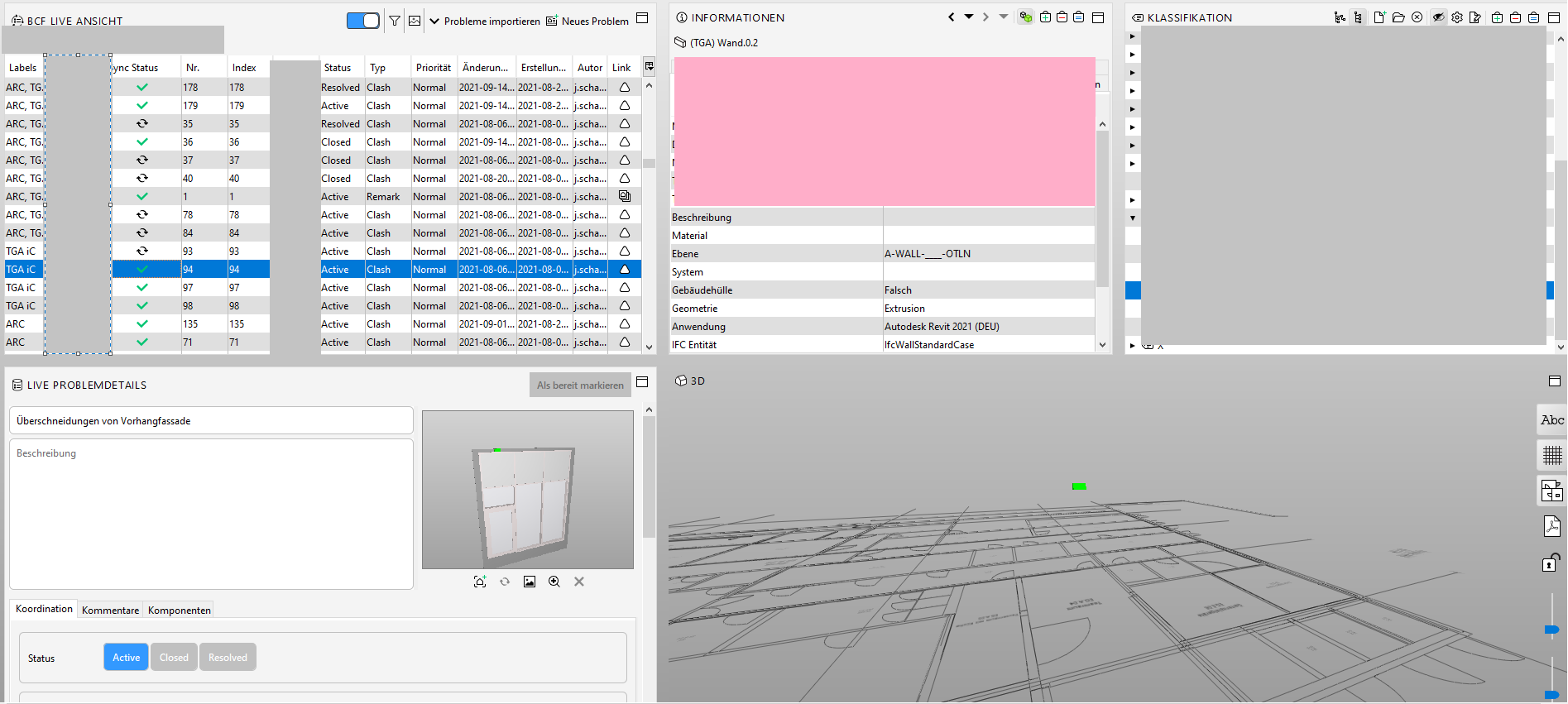
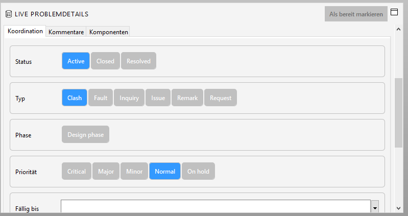
The interface of the BCF Live view has made some small steps towards a better usability but compared to the problem details in the communication tab I think it is rather big. I tend to have loads of views open and for me the most importand things about the BCF Live view are the pictures and the buttons. At the moment, no matter how I adjust the layout I somehow always end up with lots of scrolling in this special view. So I was asking myself what others think and if there are thoughts of making it maybe a bit more compact. I do appreciate that the buttons are treated with kind of a higher importance but I think they take too much space and it would be somehow good to make the slides visible all the time …
-
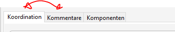
Puting the spotlight again on this topic as clicking through the issues and additionally to the permanent scrolling to check the slides, the constant switching between the tabs of the huge coordination (buttons) and the comment tab is also very annoying. It would be better to have the possibility to have it all in a view at the same time …
Copyright © 2025 Solibri Inc. | Powered by NodeBB