Visibility Woes: Active slides in presentations are elusive
-
The image below displays that selected / last active slides suffers from extremely poor visibility due to low contrast and various shades of gray. Faded colors and a lack of clear visual hierarchy make it difficult to distinguish the key information, which is bad because wrong (right-)clicking on a a slide has normaly unwanted side effects.
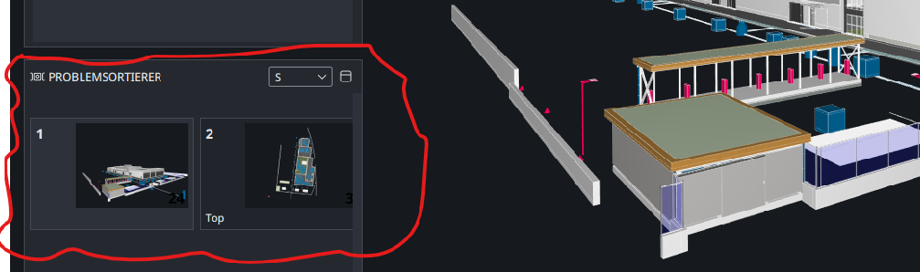
Shortcuts are helping here but not everybody knows them and imho this issue can be very easily resolved with a better UX. Moreover it would be great if there would be addeed another option for size like ‘XS’ to make the preview tiles even smaller. S is not really using the available space very efficiently.
-
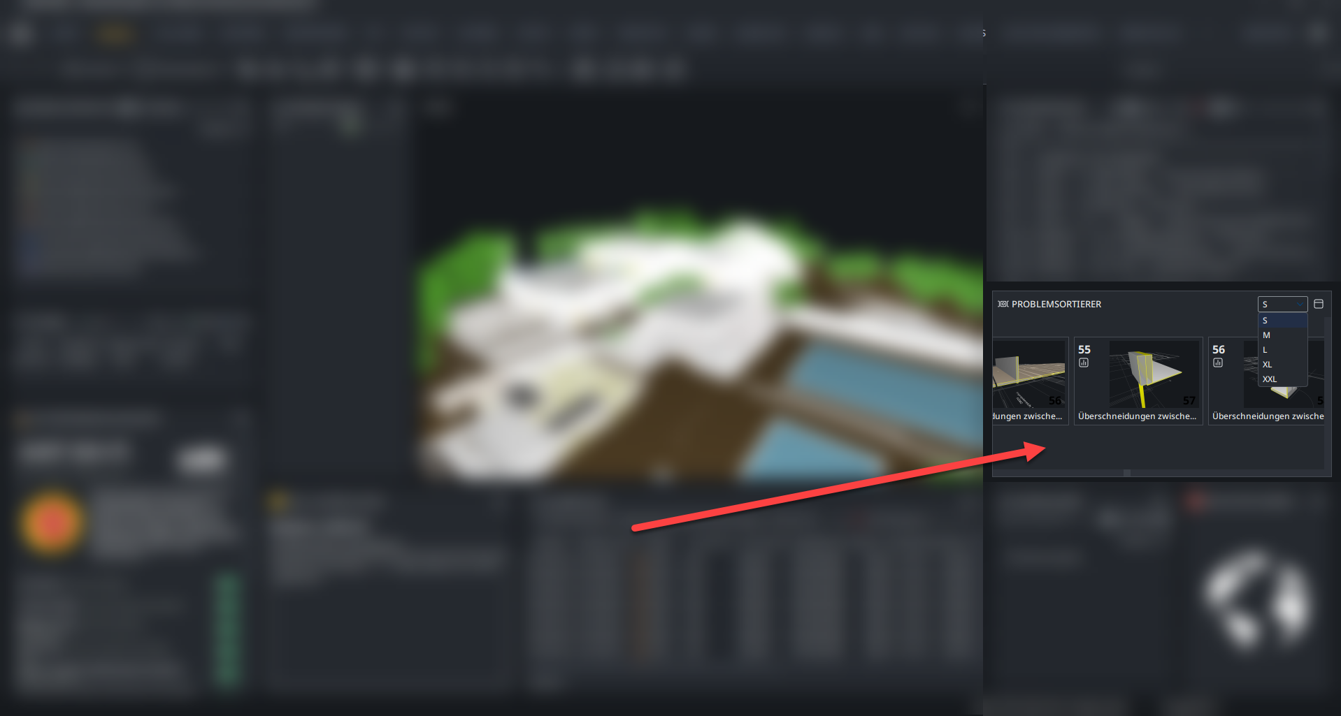
I am bringing this again and add some more context up because for me it is not understandable why there are five different options to change the image size but especially S is not really making out the most of the available space. To improve this, I suggest adding a more flexible option that e.g. allows for selecting the desired grid (fit-to-size scaling) of images, enabling better allocation of tiles and more efficient use of the available space.
-
@JSN said in Visibility Woes: Active slides in presentations are elusive:
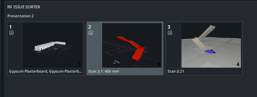
The image below displays that selected / last active slides suffers from extremely poor visibility due to low contrast and various shades of gray
Is this still valid?
This is version 25.6
-
Is this still valid?
The visability of the selection contrast has been improved a while ago! Thanks.
I added the follow up post to this topic as I thought it might be a good fit here.
Copyright © 2025 Solibri Inc. | Powered by NodeBB