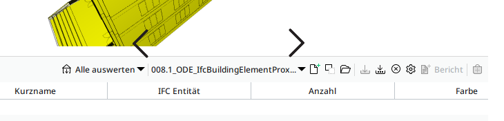
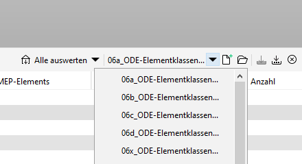
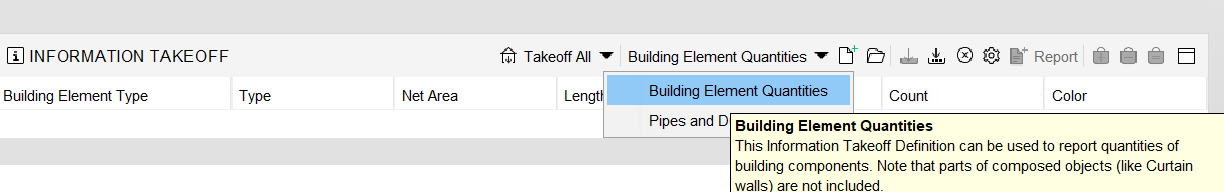
Names of ITOs are getting trunca...
-
@Matti-Kannala
Maybe it is time to make the ITO chooser wider and add the title as tooltip.
This is the way. Afaik currently the description is shown in tooltip, so would be good to have a combination of title and description instead of solely replacing it with the name.
-
-
@Matti-Kannala The tooltip seems to be good. Not sure if witdh already was increased a bit and flexible adaptability in terms of dynamic size adjustments are already considered.
Edit: @Matti-Kannala Btw could it be that maybe it’s also the time for … https://society.solibri.com/topic/997/new-filter-ito-duplicate-existing ?
")
-
@Matti-Kannala I find the tooltips extremely impractical. They disappear after a short time and you can almost never read them completely. This is also the case with the tools - you always have to hover over the tool several times to read everything.
- Why is there a timinig in the tooltips?
- Why are they not simply displayed until you move the mouse? That doesn’t make any sense, does it?
If the tooltips would be displayed longer, then that would be a way. Otherwise it is not really practical. Why don’t you just widen the field?
-
I don’t want that I need to view the tooltip to read the title. The title needs to be visible right away, because otherwise it would only add more time to choose your ITO. For the description the tooltip can be used, but it needs the improvements that @Mario mentions.
The best for me would be that the width of the ITO chooser can be changed by the user, and that it retains that width.
-
@Ricardo said in Names of ITOs are getting trunca...:
I don’t want that I need to view the tooltip to read the title. The title needs to be visible right away, because otherwise it would only add more time to choose your ITO. For the description the tooltip can be used, but it needs the improvements that @Mario mentions.
The best for me would be that the width of the ITO chooser can be changed by the user, and that it retains that width.
Totally agree with that, better would be if the width well be automatically adjusted to the width of the longest ITO name. If not we need to be able to set width, and it should keep that width.
Keeping width of columns and elements should be a basic thing in ITO and INFO windows. Unfortunately it isn’t. -
-
@Matti-Kannala
The tooltip is a great help but the titles are still getting truncated - at least for me.
I can only repeat what others have already have mentioned:I don’t want that I need to view the tooltip to read the title. The title needs to be visible right away, because otherwise it would only add more time to choose your ITO. For the description the tooltip can be used, but it needs the improvements that @Mario mentions.
The best for me would be that the width of the ITO chooser can be changed by the user, and that it retains that width.!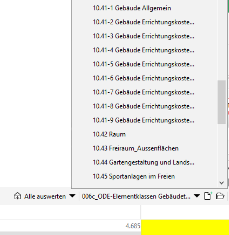
-
We did improve it a bit from 25 to 35 letter. Yes it is still truncated.
This was just small and easy improvement, not full fix. -
@Matti-Kannala
What about a totally independent window for all available ITOs where someone can choose it’s own size and has a much better overview. Switching between the various ITOs would be much faster as well. Probably it is even possible with the API to create such a view on my own. There is a getItoDefinitions method but no setItoDefinition one and I guess ‘calculate’ does not exactly do what I have in mind. Still, had not time to try it out so would be good to know if this could work.
https://solibri.github.io/Developer-Platform/latest/javadoc/com/solibri/smc/api/ito/InformationTakeoff.html -
I created an internal issue about this. Let’s see what we can do.
-
@Pasi-Paasiala said in Names of ITOs are getting trunca...:
I created an internal issue about this. Let’s see what we can do.
What can be done?
-
This might be fixed in the next release. An issue is progress. Fingers crossed.
-
@Pasi-Paasiala said in Names of ITOs are getting trunca...:
This might be fixed in the next release. An issue is progress. Fingers crossed.
Eureka! Even better if also this could be implemented >>>
What about a totally independent window for all available ITOs where someone can choose it’s own size and has a much better overview. Switching between the various ITOs would be much faster as well. Probably it is even possible with the API to create such a view on my own. There is a getItoDefinitions method but no setItoDefinition one and I guess ‘calculate’ does not exactly do what I have in mind. Still, had not time to try it out so would be good to know if this could work.
An addtionaly method in the interface for setItoDefinition would be highly appreciated. Calculate only seems to switch to a given <ItoDefinition> if there really was a recalculation performed … so my workaround to improve the usability for working with lots of ITOs is not really satisfying me so far.
Btw, the returned descriptiption is returning html, not really a problem …
… but maybe more convenient if it is plain text by default?
And the names are ignoring some special chars either like the _?
-
Not sure where I have mentioned it before but as switching through lots of ITOs is, … well, like it is, I would definitely favor buttons to at least be able to quickly switch between the previous and the next ITO …
Would have tinkered it togehter myself but the above explains what’s keeping me from it …
An addtionaly method in the interface for setItoDefinition would be highly appreciated. Calculate only seems to switch to a given <ItoDefinition> if there really was a recalculation performed … so my workaround to improve the usability for working with lots of ITOs is not really satisfying me so far.
")
Copyright © 2025 Solibri Inc. | Powered by NodeBB